Whether you are planning on staying in your home and just need some advice or considering selling and need staging advice please feel free to contact me, Julie Small ccsp, for further information.
Initial consultation which includes a thorough walk through of your home, generating a pdf report including pictures plus all recommendations.
A separate visit – Source items for your project.
Final step – Staging and showcasing ready for the market.
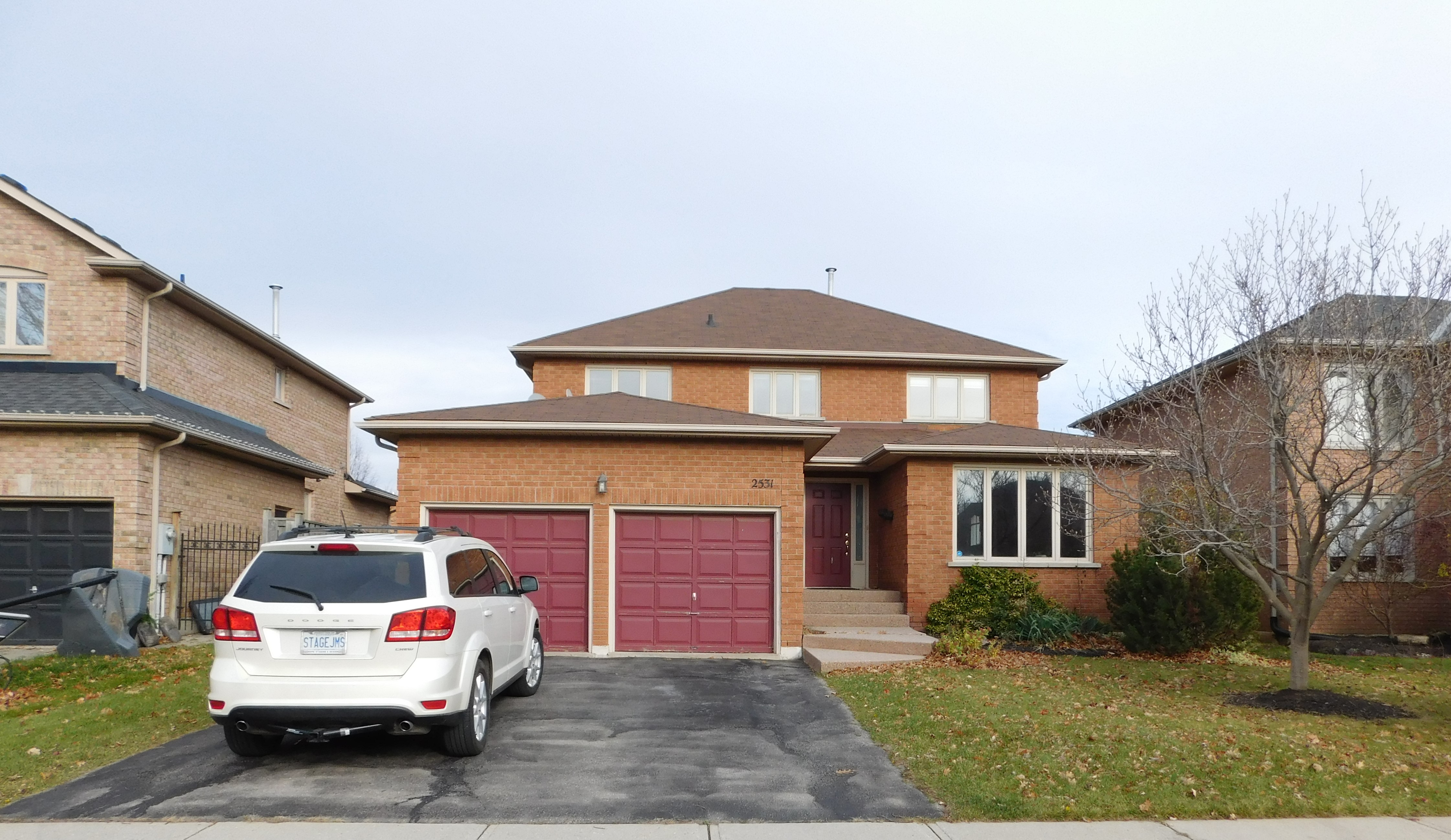
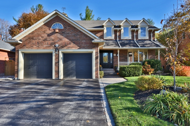
Recent project – Large 4 bedroom property initially looked tired has now in a short time been updated into a stunning property. Glimpses into how this property has been transformed.
Although the outside doesn’t look too different, the inside has really changed

Entrance
From the initial 2 colour and wallpaper choice shown in picture 1. First impressions can give a smaller, uninviting feel. Recommending wall colour, Benjamin Moore (HC173) throughout gives a seamless look. Punctuation of colour can be given in art, soft furnishings and accessories.
Landing
Amazing transformation.
Family Room and Eat-in Kitchen – Before
These two spaces were joined by a half wall. By eliminating the half wall really opened up this space. The kitchen also felt small. By moving the wall back between Formal dining room and Kitchen has really opened up this space allowing for a larger kitchen to be enjoyed.
Family Room – After
Kitchen – After
These two spaces flow much better. The floor is all the same which allows the eye to enjoy every inch of this fabulous space.
Lounge and Formal Dining area – Before
This is the first space you see upon entering the property. No ambient lighting in the lounge area and feels very dark.
Lounge and Formal Dining area – After
Some space was taken for the kitchen, by adding interest with the whaffle ceiling adds great interest combined with the lighting. This space has a modern, lighter and brighter feel.
2nd Bedroom – Before and After
From drab to fab.
Master Bedroom – Before and After
By changing the floor, lighting and paint colour, what a difference it makes.
Master Ensuite – Before and After
This was quite the transformation. Clean lines needed for this space. The new tiles do have some pattern and interest to them which works and balances the rest of the space.


