The Importance of Choosing the Right Colour
Staging a house is one aspect of preparing a house for sale. I am also asked to help with colour decisions in a space. It could be to help sell the home or for the homeowners that want to remain.
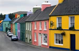
The first step is to successfully understand the function of a space. Once that is known what is your inspiration? Is it a piece of furniture, wall art, or area rug, you should have a source that will guide you in selecting details like paint colour, window treatments, etc. When shopping for a car, you should not make a decision based on the colour you like. You need to factor in the quality of the vehicle, size, mpg, price, etc. Do you choose a Volvo or a Mercedes? The same goes for wall colour. Wall colour is a detail that accentuates a space, but it is not THE space.
Assess all the fixed elements – things like countertops, the colour of the brick grout, your couch, curtains that you don’t plan on changing – to ensure the palette you choose together will complement what’s existing.
Whether you’re selling a house or changing a colour of an existing space. We are all different. Knowing what inspires us is half the battle. Some clients I have met enjoy an accent wall to be bright and the rest of the space very neutral. In that situation our eyes immediately rest at that prominent shade giving quite the statement.


Colours brighten a room. Let’s think for a moment about fashion… What we wear makes us feel good, or it should! When we add colour to our closet it brightens our mood. Head to toe in the same colour may not work, but if an element of colour is infused to a blank canvas, it changes the feel and emotion of that outfit. Something as simple as adding a colourful scarf makes all the difference. It is no different when choosing colours for our home. I love the fact that no two clients are alike which makes my job so rewarding. Colours should be enjoyed around the home. Colours can be bought in through accent pieces which gives great punctuation of colour. Our eyes are drawn to those highlighted pieces. Our eyes also notice when things don’t feel right either. For example dull spaces that just bring our mood down. It is paramount to have well balanced spaces. Lighting is extremely important in each space so that showcasing the colours is maximized to its fullest potential.
I wrote an earlier blog about light. It is attached if you missed it:- Jms Home Staging Lighting Blog

I have some examples to show on how colours can effect a space. If we have a long hallway for example that is very monochromatic is appears to go on forever. For me, it doesn’t feel very exciting or interesting……


If we now add some colour and furniture it gives a completely different feeling. Warm and inviting. Our eyes now rest on the different colours that we have added to this space. Whether it is from the green tone or the accessories. Cool and warm tones work very well together. Or having a curved hallway with a prominent colour really adds depth to this space. Now I know this isn’t everyone’s cup of tea but it just highlights what I mean.


A much more popular idea and sometimes cheaper option is to keep the walls a lighter tone but to add elements of colour. A low chair with a bright cushion draws the eye down the long hallway. A large piece of art can transform and highlight an area plus tells a story.

If the same colour is added to the trim as on the walls you will notice how your eye will just continue around the room. A lot of us always use High Gloss White on the trim to have clean crisp borders. It frames any space whether it is a window or doorway. By not using white you will see in the following pictures how your eye doesn’t stop but enjoys the space in its entirety. Painting the walls and trim the same colour usually minimizes the effect of a small room. So does painting everything a light colour. Dark colours and a lot of contrasting colours tend to make small rooms look smaller. In smaller spaces it is good to paint all one colour to help maximise the space.


We shouldn’t be scared to add colour to any space. It can be done either by adding paint on the walls or with accessories and different textures that you place in that space. Having balance and continuity is very important. Options in design and colour are endless. If you enjoy changing the feel of a space often, I would recommend keeping a neutral tone on the walls and punctuating with bursts of colour throughout the space with accessories. It means you can keep the room updated with cheaper additions as opposed to changing the colour on the walls everytime. A great example of this is the following.

When texture is added to the wall it adds a whole new dimension to the space. Combined with the red accent pieces gives a great look and feel to a dining room.
Though it’s not a brand new thing, painted interior doors are definitely becoming a trend. Painting the exterior of a front door has been popular for many many years, with red being the most popular colo ur. But, what do you think of painting the interior? Great way to add a pop of colour? What do you think of this trend?


To get a bit geeky for a moment it all started with Sir Isaac Newton……

Colour Psychology
In 1666, English scientist Sir Isaac Newton discovered that when pure white light passes through a prism, it separates into all of the visible colours. Newton also found that each colour is made up of a single wavelength and cannot be separated any further into other colours.
Further experiments demonstrated that light could be combined to form other colours. For example, red light mixed with yellow light creates an orange color. Some colours, such as yellow and purple, cancel each other out when mixed and result in a white light.
The diagram below shows how light is very important in a space.

Any kind of light – daylight, artificial light, even candlelight can change the way a colour appears.
The impact of daylight is particularly important when selecting colours.
Once a colour is selected I would recommend a 2 ft by 2ft area be painted in a light corner of the room and also another area in a dark corner of the room. Observe the new colour over a couple of days to enjoy it at different times of the day. It is a great way of not making a costly mistake by painting the whole space at once.
Paint will often appear darker when used over a large area of wall. Lighter is a safer option.
Matte surfaces give depth to a space and makes is appear larger.
Gloss surfaces reflect the light rather than absorb it.
If you need any further assistant please do not hesitate to contact me. Julesjmshomestaging@gmail.com